Analysis by CosmicTribune.com, July 21, 2022
What are we to make of the new images ostensibly from the James Webb Space Telescope?
“These aren’t photographs. They are data visualizations!” noted Tim Fernholz in a report for Quartz.
So are we to take these spectacular presentations on faith and the word of the Biden White House which has teamed up with NASA for a much-needed photo opportunity?
And what are “data visualizations”? Are they for real or the work of the graphics department?
Fernholz is at pains to put to rest any skepticism:
[T]hat data is the impact of photons — light energy — on very sensitive circuits a million miles away from us. The various sensors on the Webb Telescope measure that energy and send that data back to earth, where it can be rendered into something human eyes can see.
That rendering process can make people suspicious of these images — that we aren’t seeing what’s really there, but something artificial or manipulated. The truth is more interesting: Just like any data set, measurements of light in the universe can be manipulated.
But scientists have standards and techniques to ensure that their visualizations convey useful information about the world, just like economists trying to put their finger on rising inflation.
So NASA explanations are just as precise as those by economists explaining inflation?
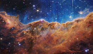
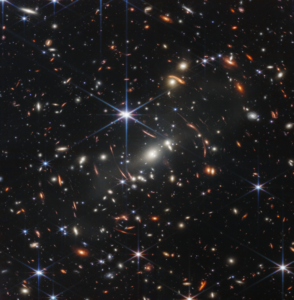
The Quartz article goes on to explain that while the Hubble Space Telescope focused on the visual spectrum of light, the James Webb Space Telescope (JWST) showcases infrared light that human eyes cannot see.
“Infrared colors are just as real as visible colors — what we do with Webb is not making up colors,” Klaus Pontoppidan, a JWST researcher, said. “We always maintain that order: Blue color means shorter wavelength, red color means longer wavelength…you can think of it as a translation of a language you don’t understand. If you had infrared eyes, this is what you may see.”
So are we, the public, being deceived? Heavens no!
Fernholz explains: “Neither of these visualizations is “wrong” or “fake.” What makes them different is what their creators are trying to communicate. On a clear day, I can see the Golden Gate bridge from my window, but often it is obscured by fog. If I had the right infrared camera, it could peer through the fog, and I could produce similar images — of the fog, or the bridge behind it.
Scientists, he concludes “are acting as designers, trying to communicate specific findings to their audiences.”
Hmmm. This says much about how “reality” is being communicated in the strange year 2022 by designers presenting as “scientists” and “journalists”.
Those spectacular James Webb Space Telescope images: Real or fake? added by Cosmic1 on
View all posts by Cosmic1 →
You must be logged in to post a comment Login